How to use readable font: plainer, more spaced-out text
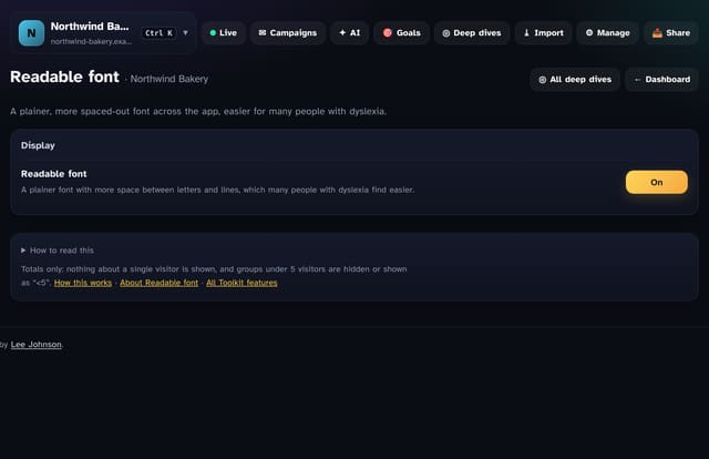
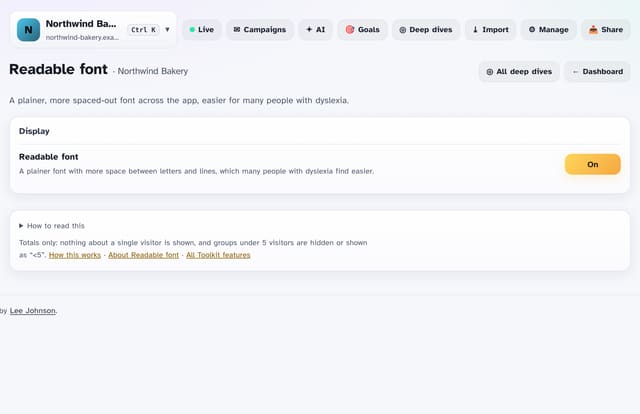
A plainer, more spaced-out font across the app, which many people with dyslexia find easier.
What it does
Turn it on to switch the app to a plain sans-serif font with a little more space between letters, words and lines, and shorter lines of text.
Why it matters
Small changes to letter and line spacing make a big difference for many readers.
How to use it
- Open Toolkit → Easier reading → Readable font, or search “Readable font” on All reports (or go to /app/kit/readable?site=YOUR_SITE).
How it works
- Open your dashboard and choose Toolkit in the menu (or the Toolkit button on Deep dives, or search for it on All reports).
- Under Easier reading, tap Readable font.
- Use the buttons on the screen; nothing is sent anywhere.
Privacy
- Collected: Nothing new from your visitors
- Not collected: Anything about a single visitor
- Not collected: Links between days: visitor ids still reset at midnight
- No cookies, and nothing stored on the visitor’s device.
- Reports show totals only: never a visitor list, IP address or single visit.
Limits
- Read from the database only when you open it, then kept for 10 minutes
Plans
Every plan, including Free. quietstats is free during launch: the Free plan covers 1 site and 5,000 pageviews a month, and no card is needed. See pricing.
Questions
Where is the setting kept?
In this browser only (local storage on quietstats.co.uk, no cookie). Turn it on on each device you use. It works with the dark and light themes and the other display options.
Related
Feature page: Readable font: plainer, more spaced-out text → What it is, why it matters, privacy and how other tools do it.